
Group Rebrand
Scout24
All-time high
Company context: Scout24 share-price milestone in 2019 and DAX membership since 22 September 2025.
Scroll horizontally to view the images. When this gallery is focused, use the left and right arrow keys.
Scout24’s brand identity film combines bright colour fields, hand-drawn illustrations, animated wordmarks and footage of cars and homes. Marker strokes highlight details such as a wing mirror and a balcony; a drawn interior accompanies the words New home. The sequence closes with Make it happen.
The Scout24 identity moves across an ImmoScout24 building sign, a corporate website, a magazine advertisement and a MieterPlus landing page. Orange arrows, turquoise frames and coloured plus signs connect photography and typography; the closing scene combines a person using a laptop with a drawn house.
Why Scout24 needed a rebrand
Scout24 had built some of Europe’s leading digital marketplaces. The rebrand focused on giving the group a more human, distinctive brand for the decisions that shape people’s lives, backed by a shared system across markets and licensees.
“She translates strategy into action, aligning it with business goals. Her outstanding rebranding efforts, achieved through close collaboration with key stakeholders, serve as a testament to her expertise.”
Leading the rebrand and rollout
Kerstin Ludwig led in-house creation, DAM and rollout for Scout24’s most comprehensive rebrand as in-house CD and Project Manager, working with DesignStudio.
Positioning
With DesignStudio, workshops and qualitative interviews from late 2018 sharpened the positioning and simplified the strategic framework. The positioning focused on what Scout24 made possible for people: choosing a home, a car or financing a significant change in their lives. “We make hard decisions easy” became the mission, with “Make it happen” at the core.
Identity
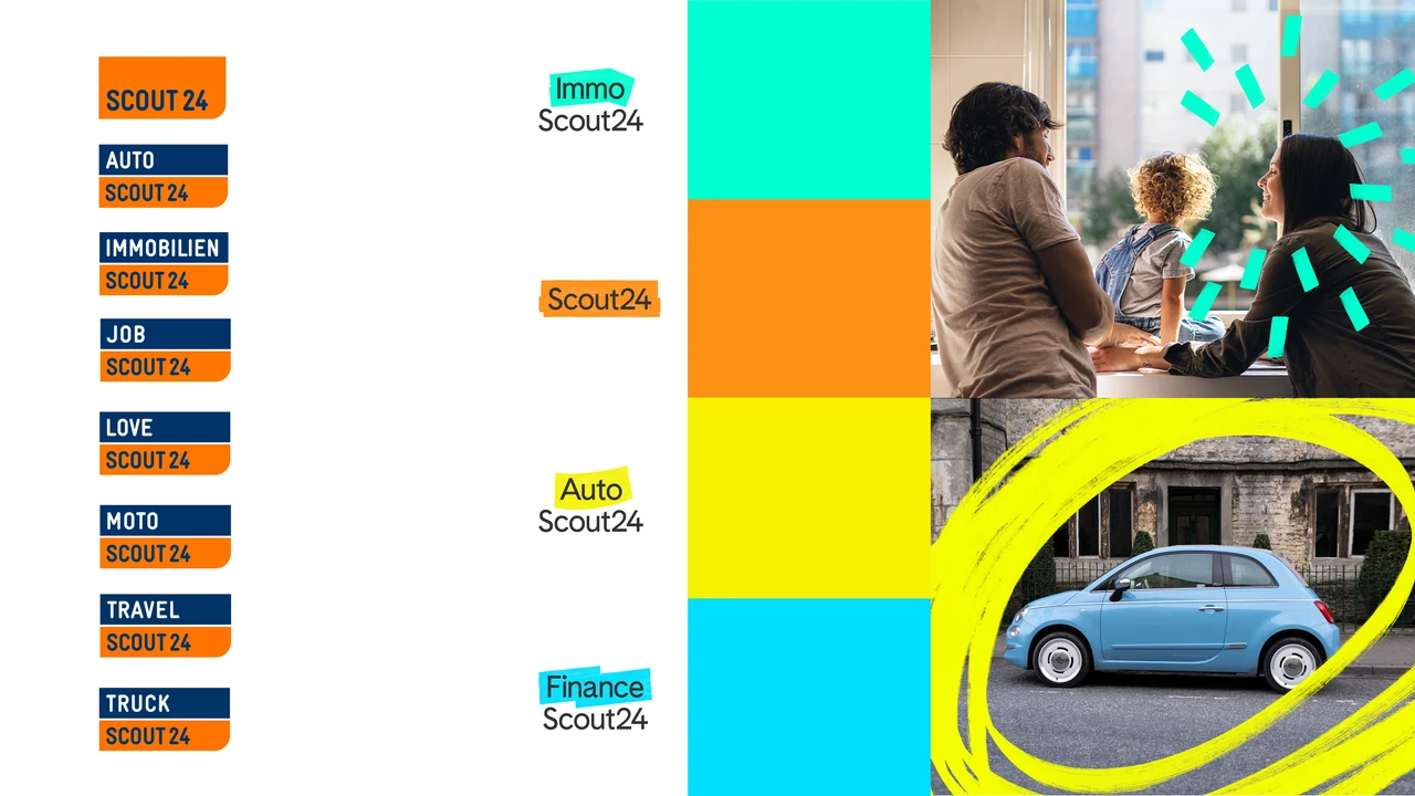
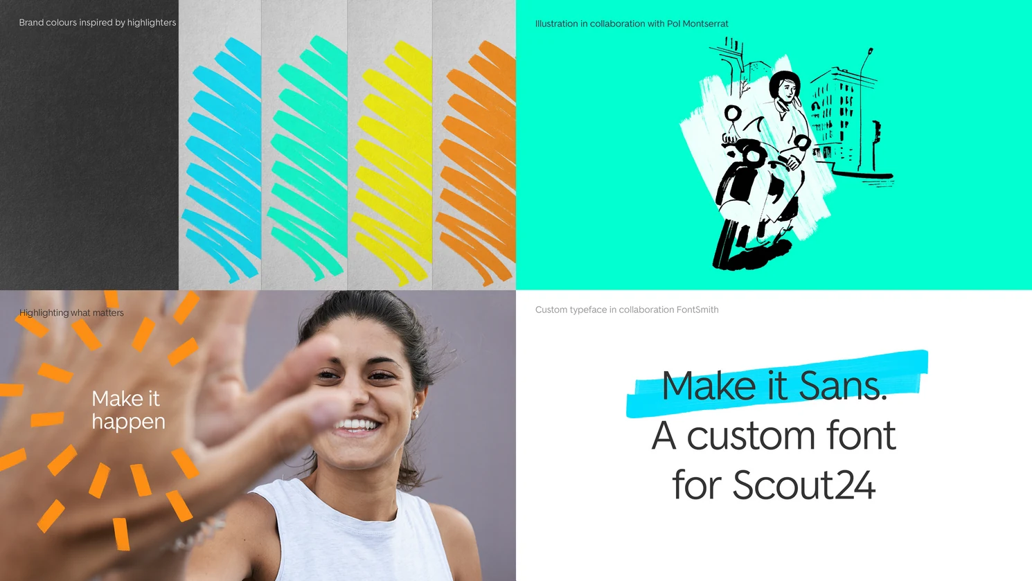
The highlighter connected the new identity with the classified ads Scout24 had brought online. Underlining, circling and marking became a vivid design language that made the promise visible. Each marketplace had its own lead colour within the family. Make It Sans added warmth and character; photography showed people in real decision moments, and sketch-like illustrations captured the first spark of an idea.
The system connected marketplaces, sub-brands, products, services and licensees in one family. Each kept its own expression within a shared, personal and optimistic identity.
Rollout
Ludwig’s remit included contractor, legal and licensee coordination. Alongside the identity, she selected and implemented the central Brand Hub and DAM, with shared guidance, templates and training. With DesignStudio and support across marketplaces and teams, implementation continued through lockdown. Creation was taken on-house with the Insourcing of a Creative Studio, where Kerstin has taken the lead. The sonic identity was developed with audity under Ludwig’s art direction.
Brand adoption and recognition
Scout24’s rebrand won the German Brand Award for design and received a special mention for strategy in 2020. The sonic identity added a Red Dot Award in 2022.
The award-winning identity and shared infrastructure became a foundation for further development across acquisitions, services and licensees over the following five years.
Company context
Scout24 reported a then all-time high in its share price in 2019 and entered the DAX on 22 September 2025. These company milestones reflect wider business and market developments; an isolated effect of the rebrand has not been established.
Capabilities
- Brand strategy and positioning
- In-house creative direction
- Brand architecture
- Partner management
- Transformation and rollout
- Sonic art direction